By Carolyn Howard-Johnson
A Website owner was asked what the “three most important components are for publishing a professionally produced e-book” and he referred the question to me. As long as I was mulling over this answer this all-important question, I figured I’d pass the answer along to you, but the question was too hard to answer in its original form. I took the liberty of qualifying it with an introductory clause and here it is:
Because a self-publisher must be a jack of all publishing trades and because many readers are still not comfortable with e-books, I believe the three most important components of publishing an e-book are:
1. The cover. Visuals are powerful tools. A great book cover may be even more important for an e-book (even though it's virtual) than for a paper book. It will probably be the only visual a reader will have to connect the reader to the author's (and publisher's) credibility.
2. Great editing. Too many authors and e-book publishers think that great editing is merely the process of eradicating typos, but it's a lot more. It's grammar. It's the conventions of writing (like punctuating dialogue correctly). It's even formatting that anyone can hire done, but should know enough about to prepare their manuscript for its final edit. And it’s knowing about the things that your English teacher may have considered correct, but they’re things that tick publishing professionals like agents, publishers and the media people who get to choose a book for print or internet exposure off!
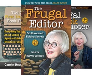
3. Formatting. I list this last because most e-book services like Amazon, Createspace, BookBaby etc. make it clear that formatting is essential and provide guidelines for getting it right. I included expanded step-by-step instructions for formatting your book for Kindle directly from my publisher, Modern History Press, in the Appendix of my multi award-winning book on editing. For the recently released third edition of The Frugal Editor, go to https://www.amazon.com/dp/B0BTXQL27T) to get the Amazon special for the whole series of my HowToDoItFrugally series of e-books for writers with one click.
Note: You should know that when a reader buys your e-book on Kindle, they get to choose what reader format they prefer, and it costs you no extra time reformatting and tracking several for e-book exposure on different platforms.
PS: The fourth most important component of e-books is marketing. No e-book—no book!—is truly published if it hasn’t been marketed. It’s part of the publisher’s job no matter how it is published or who the publisher is. And if it is self-published, marketing is as much the author’s job as the writing of the book. Everything you need to know to market your book the way a professional would if you had the money to hire her is in the tried-and-true The Frugal Book Promoter, https://bit.ly/FrugalBookPromoIII

Carolyn Howard-Johnson, author of This Is the Place; Harkening: A Collection of Stories Remembered; Tracings, a chapbook of poetry; and how to books for writers including the multi award-winning third editions of, The Frugal Book Promoter: How to get nearly free publicity on your own or by partnering with your publisher; The multi award-winning second edition of The Frugal Editor; and Great Little Last Minute Editing Tips for Writers . The Great First Impression Book Proposal is her newest booklet for writers. She has three FRUGAL books for retailers including A Retailer’s Guide to Frugal In-Store Promotions: How To Increase Profits and Spit in the Eyes of Economic Downturns with Thrifty Events and Sales Techniques. Her blog TheNewBookReview.blogspot.com, lets authors recycle their favorite reviews absolutely free. Find submission guidelines at https://thenewbookreview.blogspot.com/2023/05/send-us-your-fav-book-review.html.
A


